Kerama Marazzi Tile on the Kitchen Apron
Ceramics combines the sophistication of the design and the highest quality. The Kerama Marazzi tile is perfect for the kitchen apron, because in addition to listed pluses, it is also different and affordable price.
Why exactly tile?
The kitchen work surface is subject to a constant influence of various factors. It is water, and steam, and fats, and air heating occurring during cooking.
Ceramics, in contrast to other materials, withstands both temperature differences and high humidity. It is distinguished by strength, does not emit harmful substances, not deformed, unpretentious in care. The tile is easy to clean from pollution, and its color will not fade away from time or on the effects of sun rays.
Benefits
Cerama Marazzi is part of the international concern with Italian roots. This is one of the most popular ceramics and granite manufacturers in Russia. In addition, the company produces mosaic, panels, borders, plinths and other decorative elements.
What are so good products of this company?
- Design. The company's collections are developed with the participation of professional designers. The range presents both classic elegant models, and extravagant ultra-trendy options. New thematic collections are produced annually.
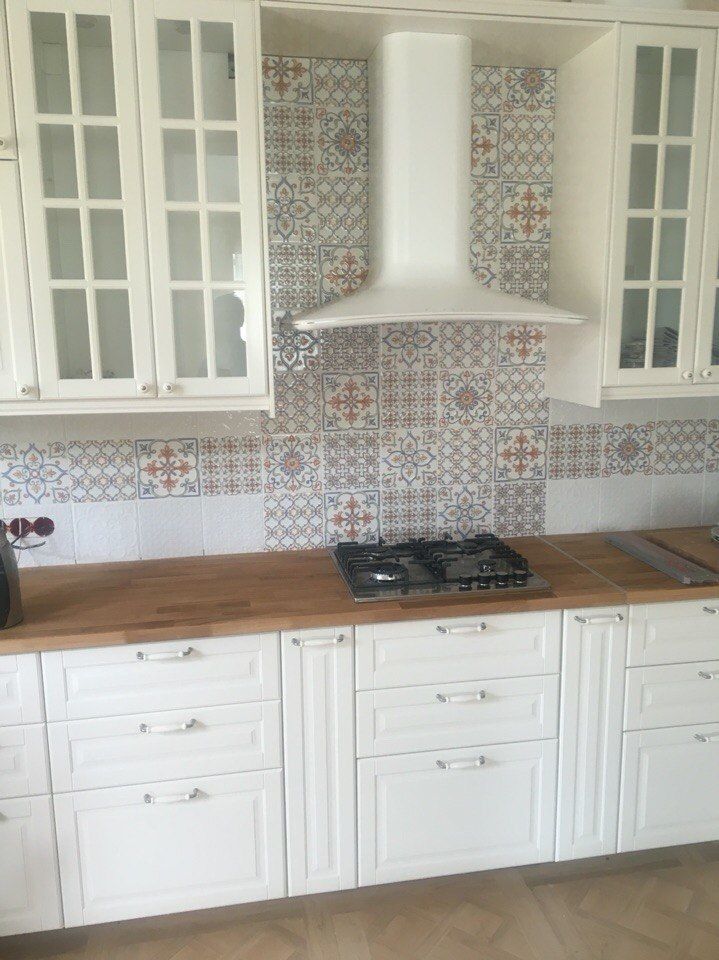
The kitchen apron must be harmoniously combined with the headcase and the common interior of the room. A variety of color solutions, shapes and styles, as well as a wide range of prices allow you to choose the appropriate option for any kitchen.
In addition, buying a brand product set, you will receive not only ceramic squares, but a whole harmonious series, including the basic tile, decor, borders and other elements. Thanks to this, you can create a real stylish composition in your kitchen.
- Quality. The company's products comply with international standards and has all the necessary certificates and expert opinions. Production uses the most modern equipment and latest technologies. Multistage control guarantees strength, wear resistance and impeccable appearance of products. In addition, in the manufacture of tiles, the firm uses only natural materials, which indicates its safety and environmental friendliness.
- Price. Despite the impeccable quality, the company's products refer to a moderate price category, which is significantly different from more expensive Italian analogues.
How to choose
In the assortment Kerama Marazzi you can find entire series offering ceramics and for floors, and for walls in a single design. This makes it easy to choose the option of harmonious design of the room.
However, this is not the only option, because the fantasy is limitless. To decorate different surfaces, you can also choose products from different collections. This option is suitable for those who want to make the kitchen design more original, as well as the owners of an apartment with an already renovated floor.
In such cases, when choosing a suitable option for a kitchen wall, you should follow the following principles:
- the color of the apron should be a few shades lighter than the floor of the floor room
- for a small kitchen, it is better to choose a glossy tile of light tones, visually expanding space
- also, for small rooms, it is recommended to finish the walls of a small ceramics, because the products of a large format on the wall of the miniature kitchen will create a feeling of cramped
As for quality, Kerama Marazzi products are always on top. But still, when buying it is important to pay attention to some points.
- It is necessary to immediately calculate the desired number of tiles and buy everything at once. After all, the shade of material from the same collection, but from different parties can be slightly different. The inconsistency of the tones can spoil all the impression from the decor of the walls, so this moment is so important. It is also desirable in the store to compare the color and size of products from different boxes. They must be identical.
- Make sure that there are no cracks and chips on the purchased material, because with incorrect storage or transportation such damage is possible.
- Calculating the amount of material, add 10% to the resulting amount. This stock will allow you to replace what may accidentally be damaged during the repair work.
Color solutions
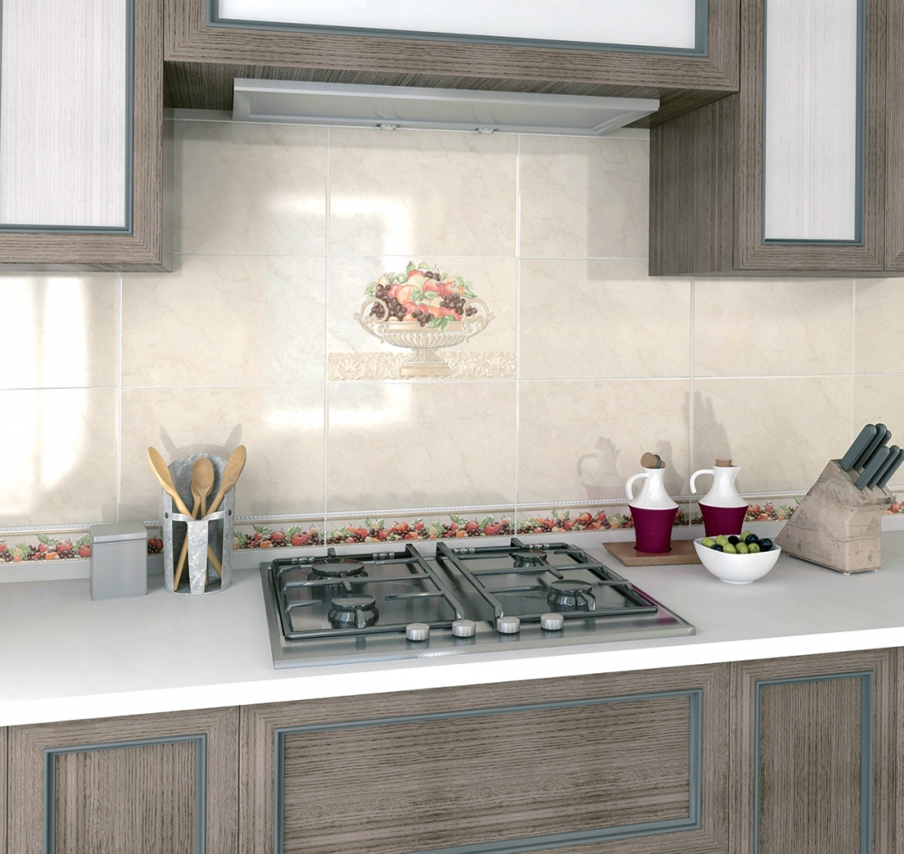
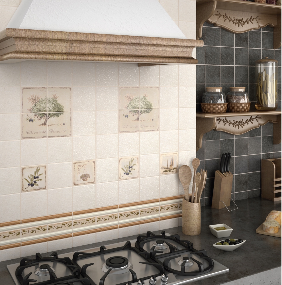
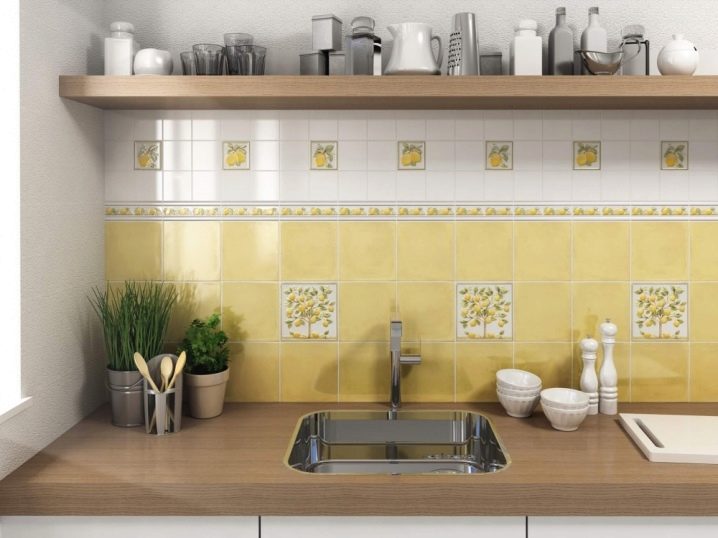
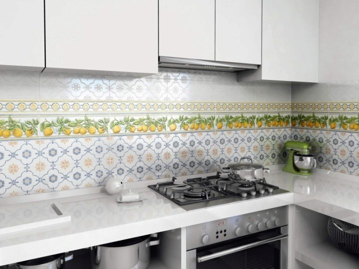
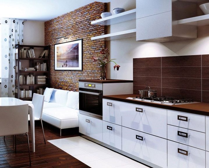
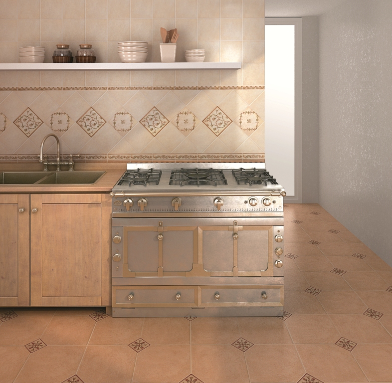
Usually warm tones are used for kitchen decor. The most suitable colors: all shades of orange and yellow, pale pink, white, beige. Request in this color scheme and brown elements.
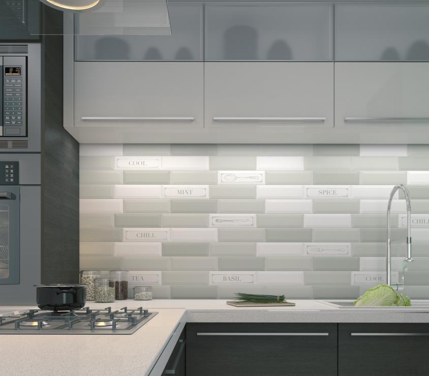
Blue and greenish shades in the kitchen should be used carefully. However, if they are harmonized with furniture and a common room design, then such cold colors will be perfect in this part of the apartment.
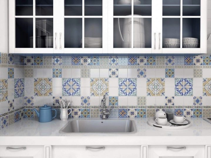
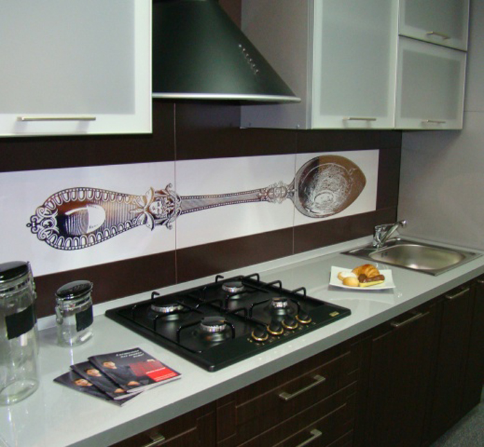
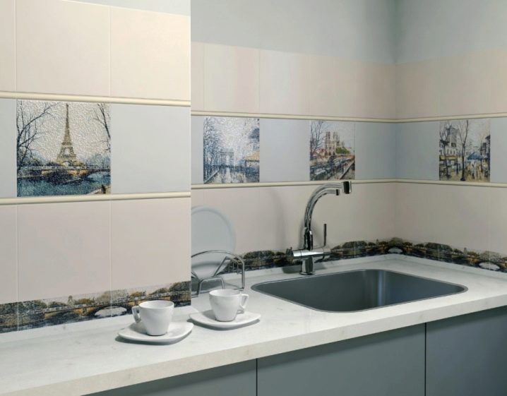
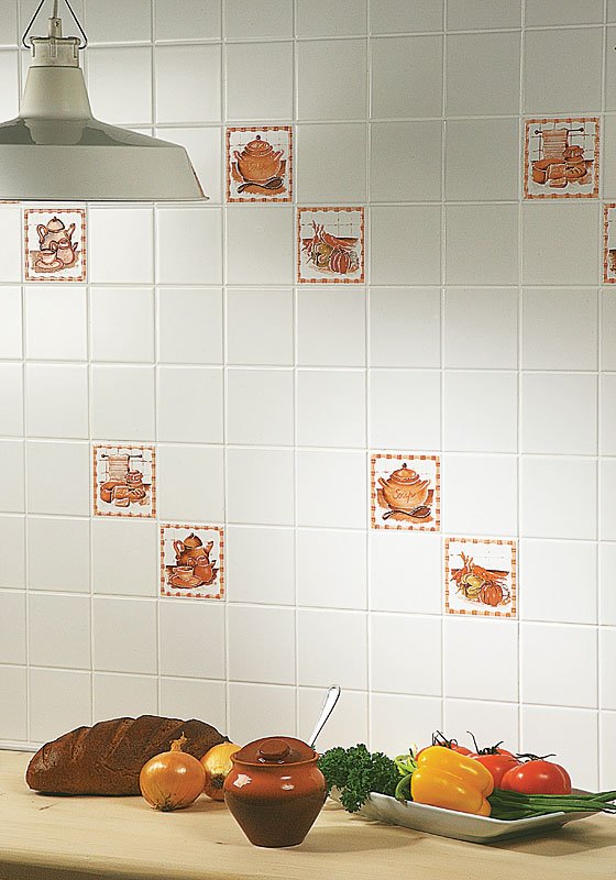
As for the drawings, it can be vegetables and fruits, appetizing sweets, floral motifs, kitchen appliances, dishes and other images. Lovers of a more unobtrusive and peaceful interior will be suitable abstract ornaments. Minimalism connoisseurs can choose monochon ceramics on apron. After all, even this option will be beautifully looked with a color combination with a headuit.
Basic brand collections
Cerama Marazzi company creates its collections on the basis of traditional motives of different countries, combining them with modern decor trends.
- The English collection includes tiles of restrained pastel shades. It uses gentle floral motifs and inconspicuous prints. At the same time, the ceramics of this direction is not primarily, it is exquisite and elegant. This option is ideal for the kitchen in a classic style.
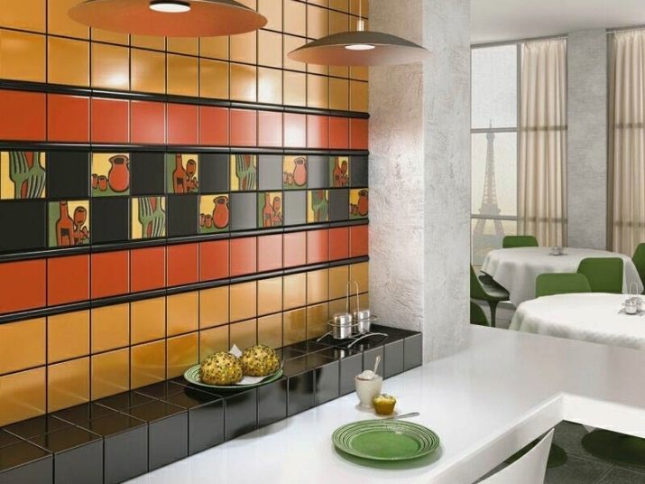
- The British series is brighter and eccentric. This is the style of a modern city in radical red, black, dark brown tones. Such a design will have to taste to lovers of clear lines and modern minimalism.
- Scandinavian options are also gentle, like products in English style, but the color scheme is colder here. Dazzling white in combination with gentle-lilac, gray and pink creates a mood of freshness and coolness. Among the prints there are vegetable motives, images of representatives of the northern fauna and other drawings.
- French style is designed in soft and deep tones. Noble and elegant design, originality of patterns - all this personifies the charm of one of the most romantic countries.
- The Roman series includes a variety of color options. Abstract patterns are dominated here.
- Japanese grace also reflected in the company's products. This collection is extravagant, but at the same time strict and withstand.
- The Latin American series includes juicy products, reflecting the flavor and dynamism of this hot country.
- Indian brightness is embodied in brand ceramics with soft tones and prints in national stylistics. A real holiday of colors in your kitchen.
- The Italian series is calm and exquisited. Beige and brown color dominate here. There are products in the laconic black and white gamma.